Golden ratios can be applied to achieve a sense of natural balance and proportion that applies to any kind of graphic design.
As explained in more detail in the “Design and Composition” post, the PhiMatrix grid can be applied both horizontally and vertically at the same time as a tool in composition. The examples below, however, show the vertical and horizontal elements separately as this makes it easier to see their application and impact.
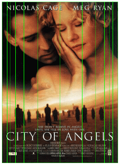
Note how virtually all the key elements of design in the movie posters shown below are aligned to the golden ratio grid lines provided by PhiMatrix. Note too that even though the golden ratio can provide a framework, its application is different in each image. This is no more a limit to creativity than using a color wheel or perspective lines. It simply delivers great design aesthetics, and with simplicity and speed.
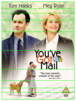
Note the position of the title, the subtitle, the portraits and their names. (Using Center option on grid lines.)
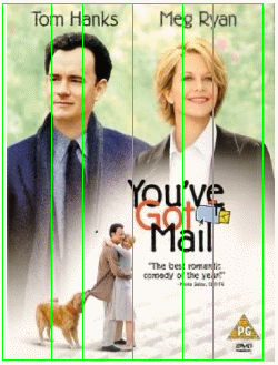
Note the width and position of the movie title and the width and position of the key facial features. (Using Center option on Grid, offset slightly to the left.)
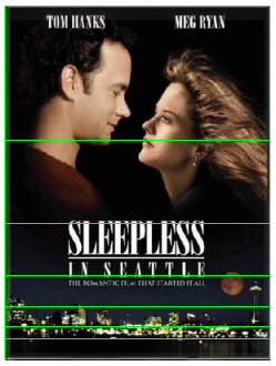
Note the position of the title, the skyline and the waterfront. (Using Bottom option on grid lines.)

Note the width of the title and the placement of key facial features within first phi line and rest of face within second phi lines. (Using Left & Right option on grid lines.)
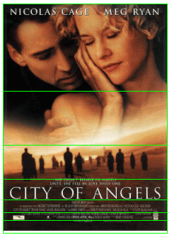
Note the positions and sizes of the title, the silhouetted figures and the faces. (Using Bottom option on grid lines.)
Note the width of the title and silhouetted figures and the positions of the key facial features framed inside every other phi line. (Using Center option on grid lines.)
Fonts and logos too
PhiMatrix can also be applied to create stylized results in fonts and logos. Note in “Sleepless” above how the tips of the middle line of the E fall right on the second phi lines, while the tips of the E, L and S very closely align with the first phi lines.
![]()
See other design applications on the Logos, Products and Web Site pages, or see all applications on the Portfolio page.
I never knew this number existed. Is quite interesting. Hopefully I can find a way to apply to my life.
Actually this isn’t totally convincing for me – quite a few of the lines on the grid do not coincide with a natural boundary in the design. Others are obviously placed using a different geometrical idea – e.g. Tom Hanks and Meg Ryan’s names are centered with in each half of the ‘Sleepless’ poster, and in the ‘You’ve got Mail’ poster lines go randomly through the people and dog’s legs. I think the ratio can be used to good effect, but maybe it isn’t quite as pervasive as is being suggested?
The main point is that the major composition elements of these posters are at the primary golden ratio lines, not that every aspect of the poster falls exactly on a golden ratio line. The major golden ratio lines, the two in the middle. are close to a perfect fit. The minor lines (e.g., the golden ratios of golden ratios) are just added to illustrate that designers often make composition decisions close to golden ratio points even when not consciously designing with the golden ratio in mind. That’s not to say that EVERY aspect must conform to a golden ratio, but that it is still a great tool for composition decisions, as illustrated by these posters.